TDACTU offers you to (re) discover the story of each franchise from the angle of branding and brand image. From the logo to the colors, including the jerseys and the origin of the names, all the visual identity of the Tennessee Titans is dissected and explained in this article.
The name of Tennessee Titans
The story of the name of Tennessee Titans is rich, both marked by mythological references and a change in historical CAP. This choice of name is the culmination of a complex process, influenced by strategic decisions, cultural ties, and a desire to redefine the team after a move. A strategy often repeated by NFL teams anxious to print new impetus to their franchise.
Since their creation in 1960, the Oilers were based in Houston, Texas. In 1996, after several years of unsuccessful negotiations between The city of Houston and the owner Bud Adams, Divorce is consumed. LHe decided to move to Nashville, the capital of Tennessee. The team becomes the Tennessee Oilers for two years before changing the name In 1999. The Tennessee Titans were born.
Why the name Titans?
Titans, in Greek mythology, are powerful mythological beings, deities of the old Greece, who reigned before the gods of Olympus. This name evokes strength, grandeur and a certain majesty. He also evokes the architectural copy of the Parthenon visible in the city of Nashville.
Before settling definitively on the name Titans, several other names had been envisaged for the team. Among these options, there are eu Cougars, stallions, Tornadoes, Copperheads, South Stars and Wranglers.
The name change was officially announced in 1999, after the 1998 season, when the team had played for the last time under the name of Tennessee Oilers. La new identity Tennessee Titans Brand THE real start of the adventure in Nashville.
The visual identity of Tennessee Titans

The story chart Tennessee Titans is a real illustration of the evolution of the visual identity of the franchise. De its roots from the city of Houston to Its anchoring in Nashville, each logo tells a part of the history of the Titans.
THE first logo team refletE necessarily The oil industry, very present in Houston. This logo, which dates from the creation of the team in 1960, consisted of a mix between a American football player and a cowboy. In the background, we can distinguish the typical architectural lines of the region's oil industry.These first two logos, directly linkeds to the history of Houston and its belonging to the city, disappeared respectively in 1961 and 1968.
The legendary drilling tower of the oilers

There follows a redesign of the graphic identity of the logo. For the next ten years, The Houston Oilers logo will be a stylized American football helmet, with an oil drilling tower drawn on it. The first version of the logo was first of all black, until 1971. Then, from 1972 to 1979, the logo took a blue shade with a red drilling tower.
From 1980 to 1998, the Oilers simplified their logo. They remove the American football helmet and only keep the oil drilling tower. The structure is blue on a white background with a red outline. This logo is kept for 18 years by the Oilers and it even resists the move to Nashville. But, two years after the move, the owners want to breathe new identity into their franchise. The name changes in 1999 at the same time as the main logo.
The main logo of Tennessee Titans
The main logo of the Titans, created in 1999, resisted the test of time since it is the same used today. The stars recall the flag of the state of Tennessee. The letter t symbolizes, for its part, obviously the name of the team but also the name of the State. The flames presentes In the F logowet certainly reference to one of the primordial forces In the universe, creative and destructive fire. The logo can also represent a stylized comet, symbol of the appearance of titans on earth.
The main colors are white, metallic blue, red, navy blue and silver. The Titans have always had a simple visual identity since they have only one alternative logo. It is a stylized sword, presenting the same circle as the main logo with its three stars. The sword can also be read as a variant of the letter T of the main logo.
Titans Wordmark logos
These are typographic variants that focus only on the name of the team, without additional graphic elements. The font used in these logos has changed over time. From a strong police at the time of the oilers, we arrived at a much finer and worked police force for the Titans. Sometimes, The logo Wordmark is also accompanied byu main logo of the franchise.

Tennessee titans outfits
Despite successive name changes and the move of the franchise, the history of the Tennessee Titans uniforms remains fairly linear. THE first uniforms, those of the Houston Oilers, already wear the two dominant colors of the team: blue clear and white. At the time, red was also visible on the jerseys, in the players of the players.
The Houston Oilers will keep this visual identity until 1998, when they transformed into Titans of Tennessee. Light blue is not deleted but it then migrates in secondary color. Navy blue is invited to the main colors table and white remains present in all uniforms, domicile as exterior. The only color that definitively disappears from the uniforms of the titans is red. A color that could be seen both on helmets and on players' uniforms until 1998.
Blue Titan invites itself into visual identity

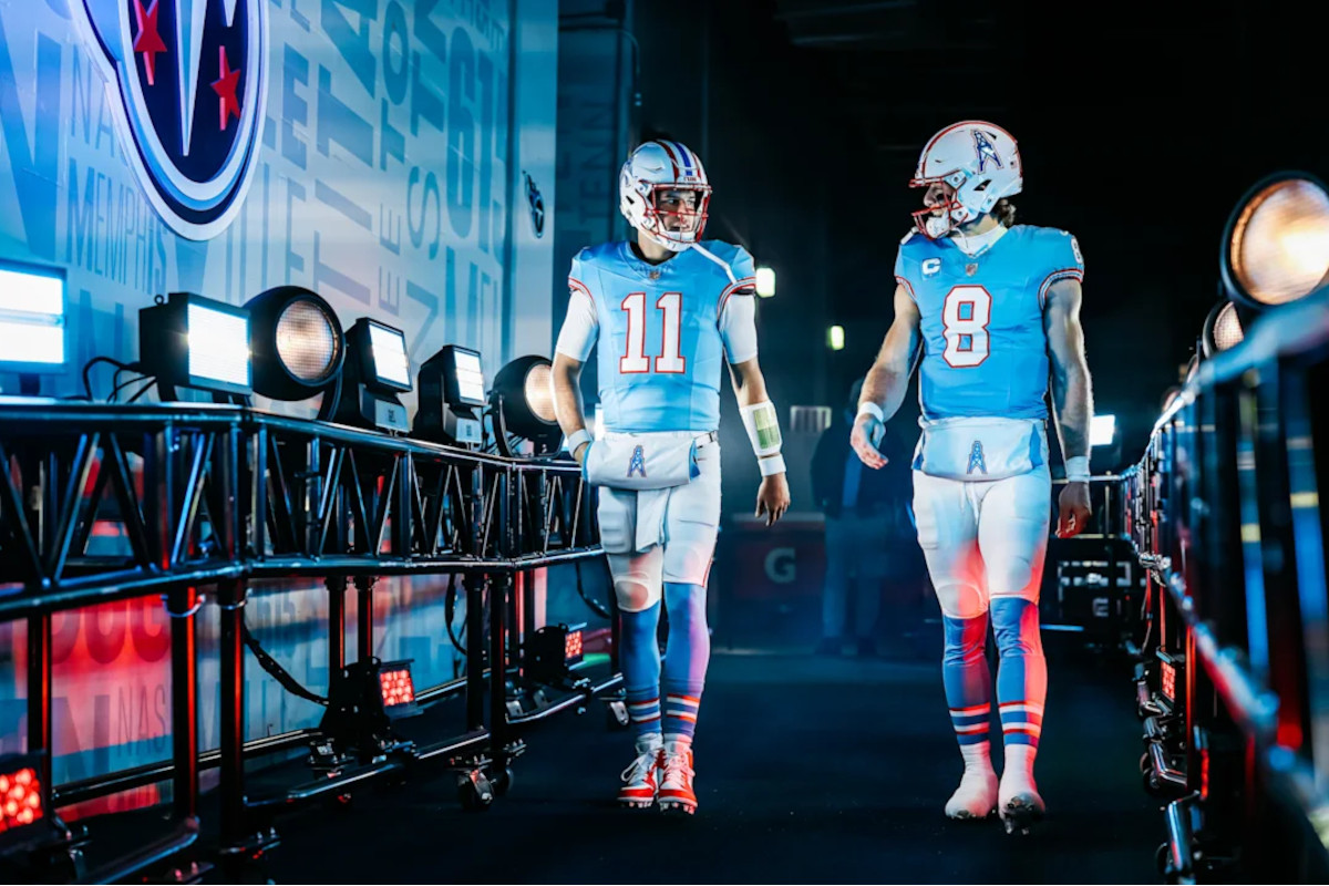
The Tennessee Titans have not experienced a big change of visual identity since the early 2000s. They still wear the same combinations of outfits today as at the time. Titans have three combinations of main uniform colors : a navy blue jersey (home), a white jersey (outside) and a light blue jersey (Color Rush).
The helmet, formerly white with two navy blue bands, is now the main navy of the titans with a two -tone silver strip, which imitates the sword of the team's logo. It includes a metallic silver facial mask and the logo sticker now has a silver outline. The central strip inspired by the sword begins at the back of the helmet and ends at the top at the front. The shoulders of the jerseys present the two -color sword -shaped money to imitate the team's sword.
The digital fonts are radically different: personalized angular digital fonts have been designed by thinking of Greek or Roman letters. Each issue on each jersey has a shape that illustrates the northeast corner of Tennessee while the state appears on a map, a subtle reference for fans.

Subtle details for Tennessee Titans fans
The contrasting insert under the arms of the jersey and the two -tone silver band on the uniform pants represents the sword in the team's logo. The design inspired by the sword scratch on the scratch of the pants is tilted a bit like a sword scab. The main logo of the titans is visible on the left and right hip.
The palette of navy blue, titan, red, silver and white blue remains unchanged. A second silver/gray was added to give dimension to the sword as a larger design element. THE swooshes Nike are in red and bring out the general color palette of the uniform.
The Tennessee Titans mascot

T-rast has been the official mascot of Tennessee Titans since 1999. It's a raccoon, Introduced during the first season of the Titans in Nashvillemarking the beginning of the era of the franchise under its new name and its new identity visual. Its name is a combination between the letter T which refers directly to the state of Tennessee but also to the name of the team. And the “rac” is the contraction of Racoon, which means Raton-Laver. The latter is indeed the animal emblem of Tennessee.
He is known to make zip line from the summit of the Nissan Stadium and has participated twelve times in the Pro Bowl. You can find it during events throughout Tennessee as a team ambassador :: ecommunity bounds, birthday parties, charity organizations … In short, the daily life of any NFL mascot.